


Driving a car is somewhat like making decisions based on analytics data. You analyze every aspect of your environment. You take into account your speed, the cars around you and the risk of a car rushing into your path. Also, you’re looking for the right exit leading to your destination. In short, you find the safest and quickest way towards your goal.
If you solely take into account what lies in front of you and drive faster, you might miss an important turn or end up in an accident. It might sting a little or hurt a lot, but the conclusion is clear: you missed something by working with an incomplete data set.
Every decision maker seeks insights and knowledge to steer their organization in the right direction. Data from your website, sales figures and customer feedback let you see a story that, when combined with accurate data, reveals paths towards achieving your business goals.
In analytics, you should keep two general categories of data in mind:
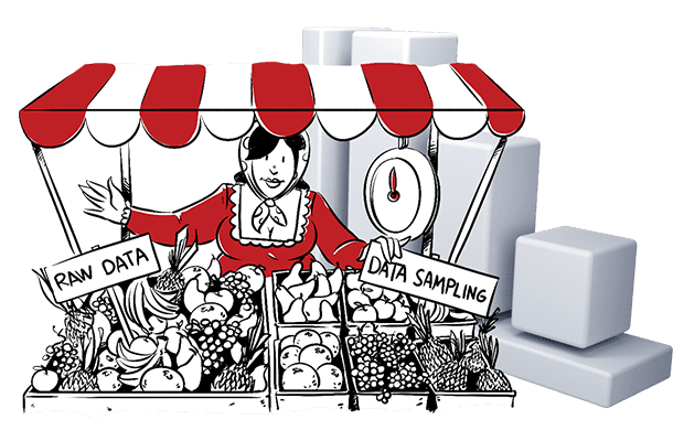
- First, we have raw data that provides accuracy and gives you the possibility to dig into details. In its purest form, it is data that comes directly from the source and can be put into any form, program or report.
- Second, we have sampled data. A subset of your traffic data is selected, extrapolated and assumed to accurately represent all data from the set. It does help with performance issues, but can also mean loss of accuracy.
In this article we will dig deeper into raw and sampled data. We will show you their benefits, but also their downsides, so you know when to look left and right, and when to look straight ahead.
How do different analytics vendors handle data?
Analytics platforms enable your organization to see what is important – a behind-the-scenes look of sorts into the behavior of your customers. Data fuels reports and lets you introduce insightful information into your decision-making process.
If you can’t decide how to approach sampled and raw data, it is always good to look at the biggest players in the industry. Let’s take a look at how vendors use data sampling and if they offer access to raw data.
| Access to raw data | Samples data | |
|---|---|---|
| Google Analytics | from 500K sessions/month | |
| Google Analytics 360 | via BigQuery | from 100M sessions/month |
| Adobe Analytics | Except in selected Audience Manager reports | |
| Matomo | ||
| Countly | Except to visualize Flow reports | |
| Piwik PRO | only on request |
In contrast to Google Analytics, all listed vendors offer full access to raw data. Still, data sampling is used in some cases – mostly to show a specific report in a timely manner.
Countly uses data sampling to visualize flow reports. They state:
“Due to the high level of processing power it requires, Flows visualizes data using sampling if the total session count exceeds a configurable threshold (default 2M). Sample is generated from 5% of all sessions.” [Source]
Adobe Analytics does not sample data in your reports and provides fresh data every 45 – 120 minutes. But it uses sampled data as a tool to increase the performance for certain Audience Manager reports. Adobe says:
“Some Audience Manager reports display results based on a sampled set of the total amount of available data. The sampled data ratio is 1:54. For reports that use sampled data, this means your results are based on 1 record out of every set of 54 records.
These reports use sampled data because they need a tremendous amount of computing power to generate results. Sampling strikes a balance between reduced computational demands, maintaining system performance, and providing accurate results.” [Source]
Once again, the platform uses data sampling as a way to improve performance when generating certain reports.
GA 360, on the other hand, applies data sampling to enhance performance. Yet, you need to wait up to 4 hours for a report and can expect data sampling, anyhow. This means your reports could be inaccurate, once you reach 100M hits per month (in GA it is 500K hits per month).
Then, you have the Piwik PRO Analytics Suite. It provides raw data for every report you get within the platform, this includes user flow reports and any other report for that matter. Piwik PRO applies data sampling only on request. Data refreshes every 30 minutes, to provide you with up to date information for your reports.
Advanced analysis with raw data
All in all, five out of six platforms give access to raw data. Analytics professionals are able to get back to the rich information pool and draw up new insights and reports if needed. It gives analysts the flexibility to create visualizations and perform analyses you wouldn’t be able to otherwise.
Therefore, it is paramount, you choose a platform that supports your needs, performs well with millions of records and gives you the flexibility you need to perform advanced analysis.
We have prepared some articles for you to make the best choice on your own. Feel free to browse and make a well-informed choice:
Is raw data expensive?
Data analysts want to work with a full set of data. Analysts want to know they can come back to a dataset at any time, to mold it into the needed report. They want to apply new filters and visualizations, and come up with new insights or new points of view.
Companies often face people and time cost when diving into advanced analytics. Raw data takes a little more time to mold into something useful. You need more skills to deal with it than with something like GA free that only has a graphical reporting interface. And if you’re dealing with huge amounts of raw data piped through an API, then you probably need data analysts with programming skills.
If you look at the costs and benefits in the long run, investing in analytics capabilities around raw data makes business sense. It will help you to draw more useful conclusions from data that might have sat unused in some report that nobody knew how to interpret or properly visualize.
You might not have the possibility to invest in those capabilities just yet yet. Then it is good to have a partner to help you set up your analytics platform and get the most out of your data. For example, a good partner will help set goals and provide feedback and guidance for how your organization collects and acts on analytics data.
Fuel your complete marketing stack with raw data
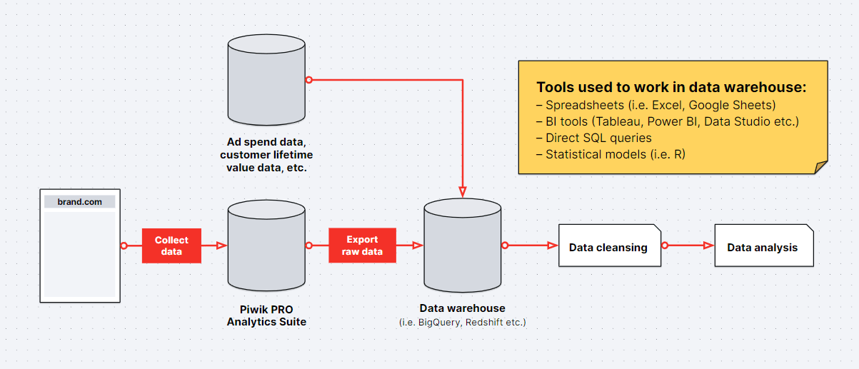
Most marketing departments already own business intelligence platforms, which they use on a regular basis. Naturally, they want to continue using them. So they look for analytics software that integrates easily into their already existing marketing stack. Sometimes, it’s not that easy. But with easy access to raw data, it becomes a completely different story.
Break down data silos
Combine raw data from various sources such as CRMs, transaction platforms, offline databases and more. By connecting sources, you connect the dots and end up with more data-driven decisions.
If you want to know more about what causes discrepancies between analytics platforms, you will find 13 possible reasons in this article:
Single reports won’t always give you a global view of marketing performance across channels. Exporting raw data from several different reports and combining it with other external data can give you that global view. For example you can analyze multi-channel attribution using raw data.
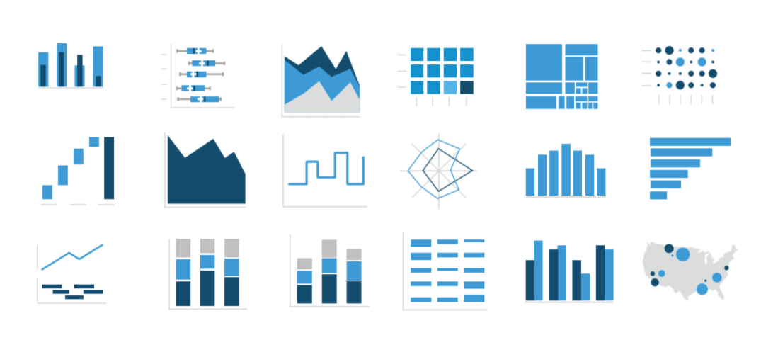
Visualize your data how and where you want
All the analytics platforms we’ve discussed so far have built-in visual reports as well as ways to create custom reports. Those reporting engines don’t always do everything you need, though. A quick way to get more options is to export raw data to business intelligence and visualization tools such as Tableau, Microsoft Power BI and Sisense.
With a business intelligence software you not only connect multiple data sources with each other, but also cleanup, shape and model your data set into the needed report. Sometimes it is the best way to make quick decisions based on vast quantities of data.
A simple table can tell a great story and give you directions, as well. Sometimes though, visualization programs might show patterns that would otherwise remain invisible.
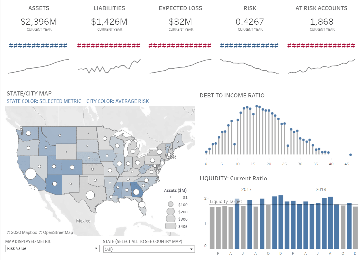
Let’s say you’re a bank that wants to visualize credit risk factors on a dashboard next to what kind of products current customers are searching for in their secure member area. This can’t be visualized well in an analytics platform such as Google Analytics or Piwik PRO, but it needs the web and mobile analytics data to understand what customers are looking for online. This case requires export of data to a BI platform where database queries, calculations and geographical visualizations can be combined to get a complete picture.
Immediate access to raw data
With Google Analytics 360 for example you do have access to raw data, but you have to jump through some hoops in order to get it. You need to use BigQuery, a Google product. This stacks additional costs that depend on your data volume. For short-term storage you have to pay $0.02 per GB a month. These costs are halved for long-term storage, but in both cases it adds more expenses to the already pricey GA360.
Piwik PRO gives you access to raw data without any added costs. Raw data is available without additional plug-ins or software. You can access historical data from at up to 25 months ago.
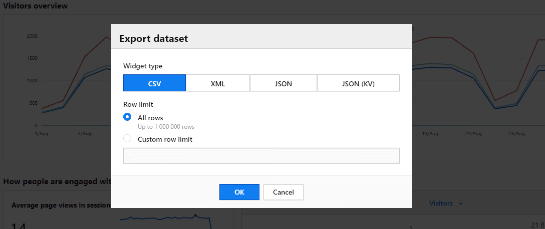
This means, you are able to download the raw data used in the report immediately, once you have created it. In Piwik PRO, you just click “export” next to the report and select the data format you need.
Export raw data via API
Sometimes raw data from just one report is not enough. You might want to integrate data from different departments within your organization. To do so quickly and easily, APIs (Application Programming Interface) come in handy.
Let’s say, you have one big database for customer and marketing data. Just quickly link your analytics data to that database using the API. This means all the data you need to build your reports is in one place – financial reports, logistics reports, or any other type of data.
Sampled data – a quick fix?
So far we’ve mostly talked about raw data. Let’s look more closely at data sampling.
Once we add up the costs of collecting and analyzing data, it makes sense why Google Analytics is used by 84.2% of all websites whose traffic analysis tool is known, according to W3Techs.com. Google Analytics is a free tool to get data about customer behavior. Its users overlook the limitations, including sampled data and lack of raw data access.
Google Analytics is a free tool, but that doesn’t mean it doesn’t cost you anything. Read our blog posts about the downsides of the popular platform:
The processes of sampling and extrapolation are complicated. Nevertheless, we would like to show you the process in a simplified way. Let’s assume you want to see the conversion rate per channel and calculate the average. The result indicates, whether you should invest more money and keep the channel on, or stop spending money there.
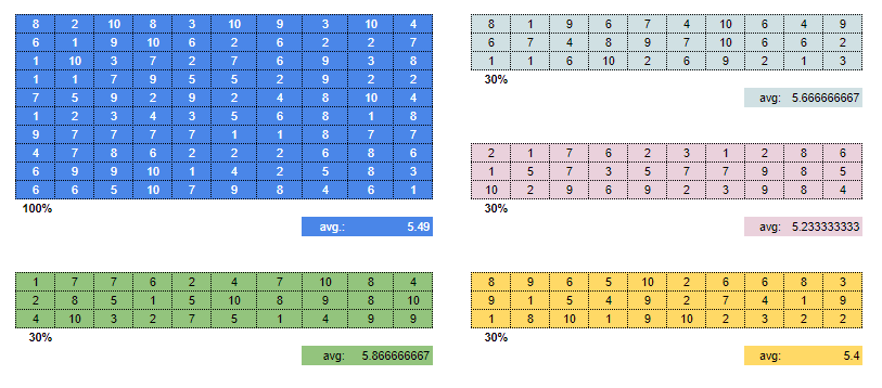
As you can see in figure A, we chose 100 numbers between 1 and 10. Then, we calculated the average. If we include the entire data set, we get an average of 5.49. But if we take a sample of 30%, we see a fluctuating error rate. Four randomly drawn samples provide different results ranging from 5.23 to 5.87. If the break-even point for a channel is 5.5, then you’ll make a different decision based on which random sample you use. Your decision will be random, in effect.
Most Google Analytics users believe that the data supplied by the platform (sampled after reaching 500K sessions per month) is good enough. It answers basic questions without any problems and shows for example:
- Features people use often
- Locations users come from
- Devices they use
Sampled data answers some of these questions appropriately. It definitely shows trends and often points you into the right direction. Given that Google Analytics is free partly because of its limited capabilities, maybe accepting sampled data is a decent compromise in some situations. So when does data sampling become an unacceptable compromise?
Data sampling accepts error rates
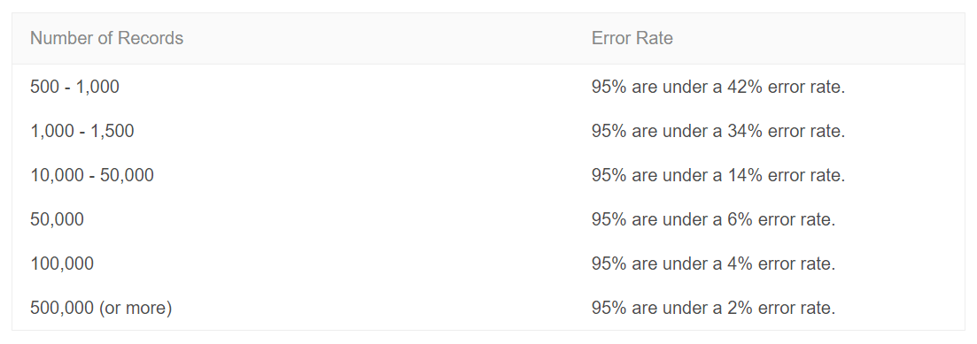
The reliability of results from sampled data depends heavily on the selection of the sample itself. In addition, the size of the extracted data set proves to be a decisive factor in determining the error rate. As you can see in this table provided by Adobe:
Fact is, statistics do not rule out a measurement error. It is even tolerated if the error is kept small, in order to reflect the complete data set as precisely as possible.
When a subset of your traffic data is selected, extrapolated and then analyzed to represent the total amount of data available, it creates a measurement error. The error rate depends on the size and quality of the sample taken. You cannot be sure whether the analytics platform you are using takes a representative amount of data or not. Adobe Analytics’ help center states that error rates occur when records:
- “Should not have been included in a report but were added anyway.
- Should have been included in a report but were left out.” [Source]
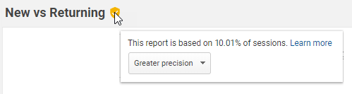
In Google Analytics, for example, it is possible to set the size of the data volume. You can choose between greater precision and shorter response time. But is that enough? Even if you run a website that doesn’t have high traffic, the chances of data sampling are relatively high. Especially when you create detailed reports showing data over a long period of time.
Of course there are ways to avoid data sampling in Google Analytics. You could shorten the time period, for example. So with a loss of analytics flexibility, you may be able to make it work.
Conclusion
Data sampling is not necessarily a bad thing that needs avoiding. It is a tool that can be used in certain situations. It avoids performance issues. But data sampling can also mislead instead of help. So it’s important to understand when and where to use data sampling.
Most of the vendors don’t sample the majority of their reports. They know: Precise data cast precise decisions. Raw data gives you insights and provides accurate information. It is a viable source for a sustainable future of your organization.
We hope we have cleared a path for your advanced analytics journey. If you should have any questions regarding raw or sampled data, or about Piwik PRO itself, feel free to contact us.